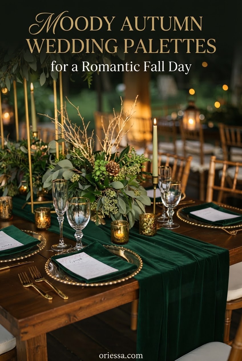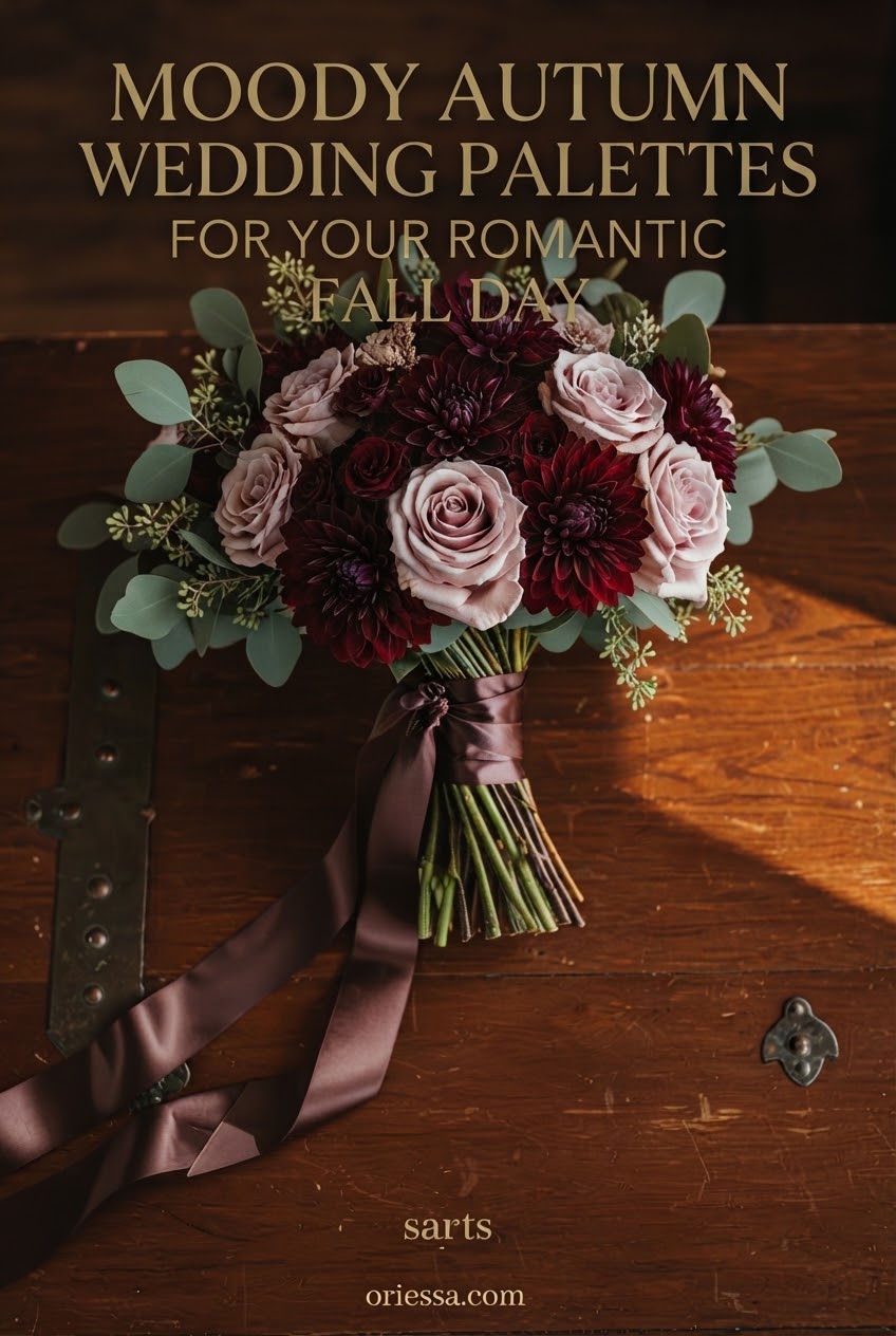
When I start dreaming up a fall wedding mood board, I always look for colors that feel like candlelight, velvet ribbons, and the last golden hour before winter. These moody autumn wedding palettes bring drama without making a celebration feel too heavy.
I pulled together fifteen combinations that work beautifully for florals, stationery, outfits, and tablescapes. Current wedding styling continues to embrace deep greens, burgundy, copper, plum, and warm neutrals for layered autumn designs.
Burgundy and Champagne Autumn Wedding Palette
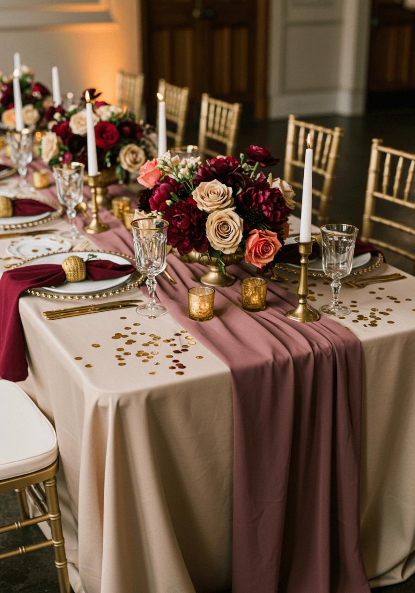
I love this palette because it feels like a vintage love letter. The mix of burgundy and champagne tones creates instant romance with velvet textures, candlelight, and soft metallic details.
I would use burgundy blooms, champagne linens, and warm gold accents for a reception that feels elegant but cozy.
Forest Green and Antique Gold Wedding Palette
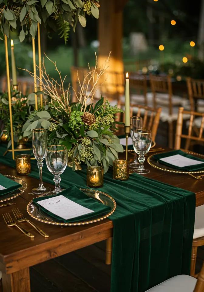
Forest green is one of my favorite fall wedding colors because it brings the outdoors inside. Pairing it with antique gold accents adds a luxurious glow without overpowering the natural mood.
I picture this palette with foliage, aged brass candleholders, and deep green stationery.
Plum and Dusty Rose Autumn Wedding Palette
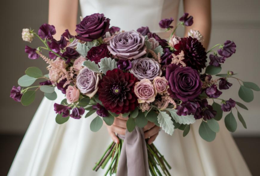
This combination is for couples who want romance with a little mystery. The contrast between plum and dusty rose shades keeps the palette soft while still feeling autumnal.
I would add velvet ribbons, muted florals, and antique-inspired paper details.
Charcoal and Burnt Orange Wedding Palette
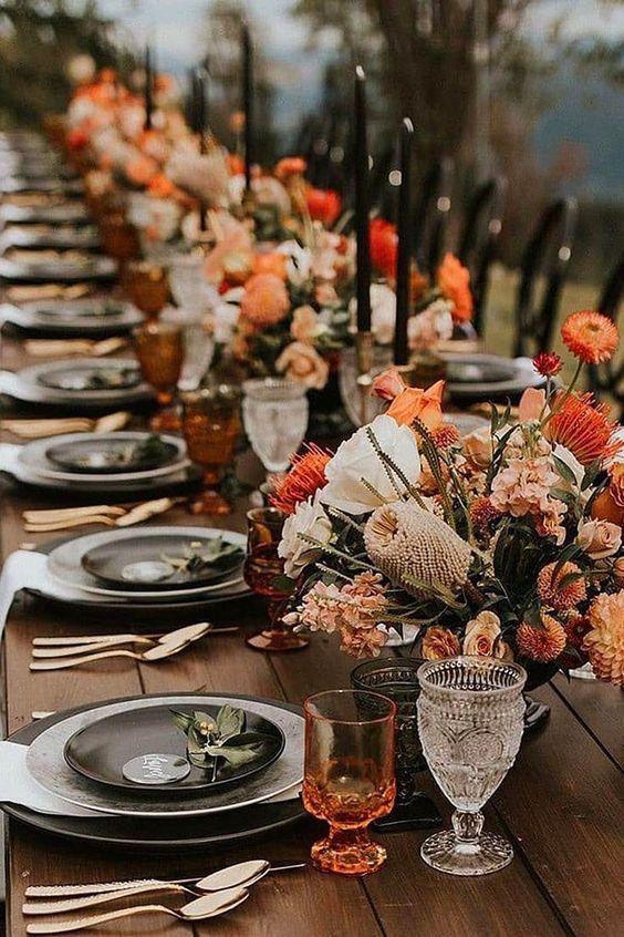
Charcoal gives burnt orange a modern edge. I love how the pairing balances smoky neutrals and harvest warmth for an evening celebration.
Try charcoal suits, orange florals, and textured fabrics for a fashion-forward autumn look.
Black and Deep Emerald Wedding Palette
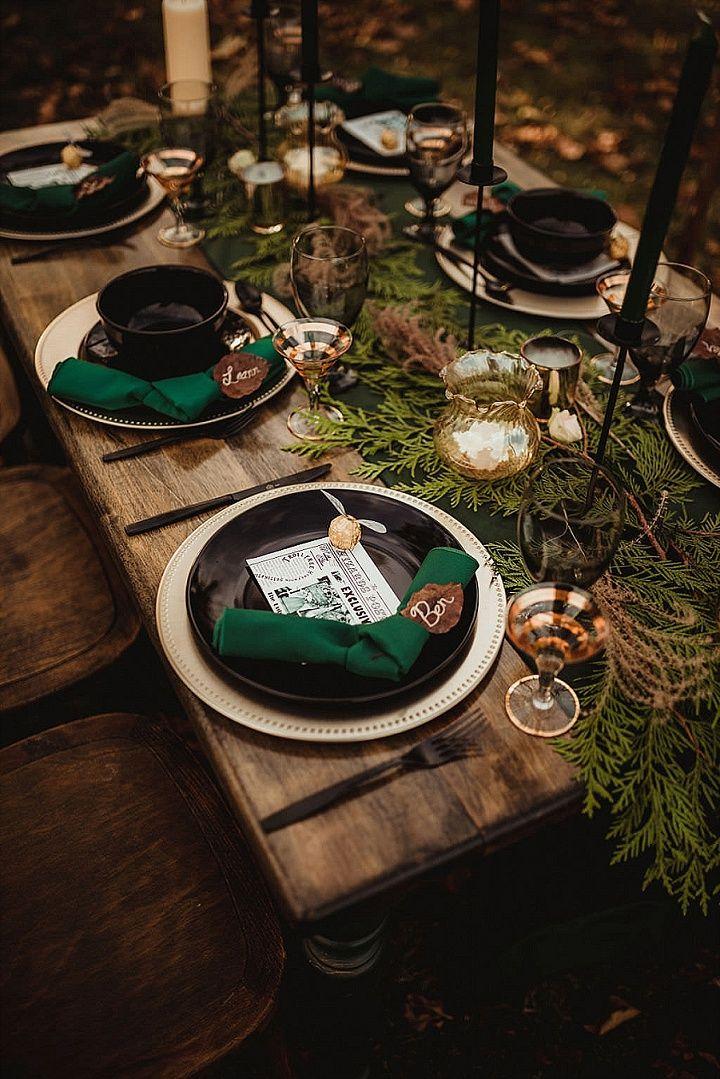
This palette feels like a dramatic garden party after sunset. The combination of black and deep emerald creates a sophisticated backdrop for flowers and candlelight.
I would keep metallics subtle and let the rich colors become the main handmade-looking details.
Terracotta and Olive Autumn Wedding Palette
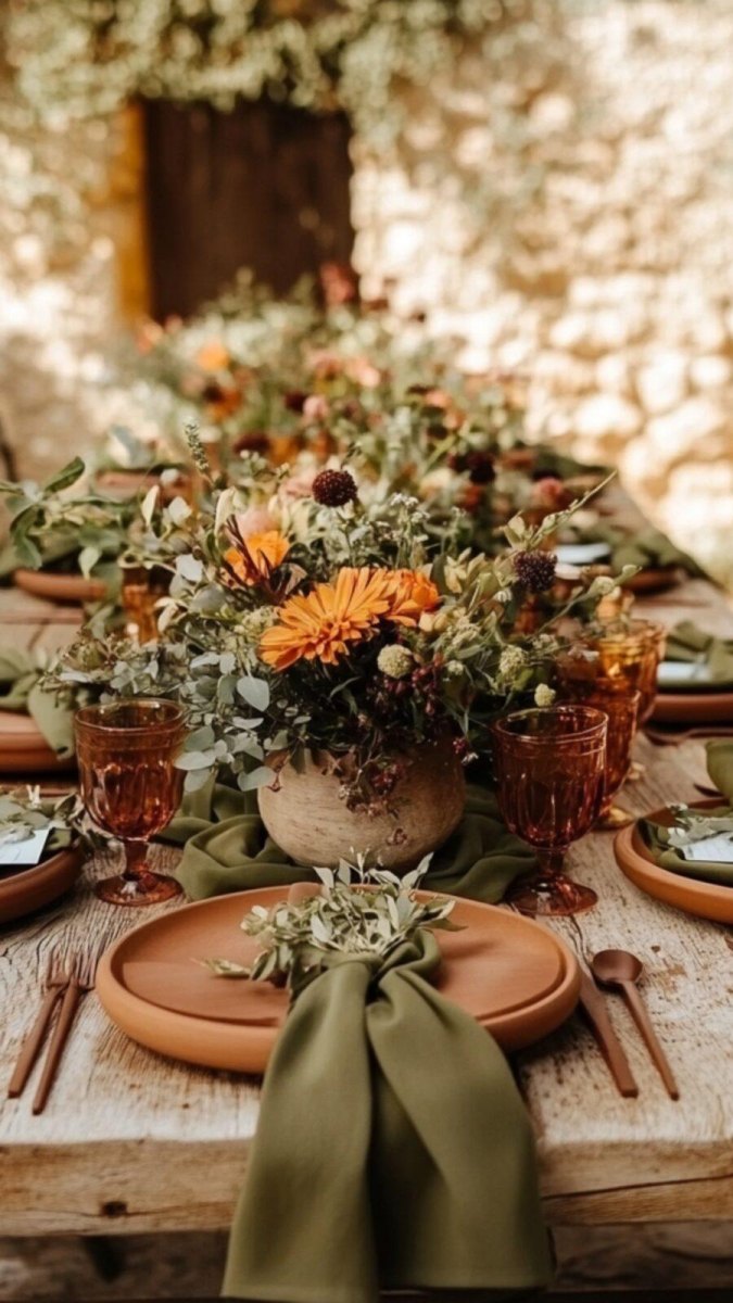
Terracotta and olive are perfect when I want warmth without using traditional orange. The earthy pairing creates natural autumn texture with dried florals and organic materials.
This palette works beautifully for outdoor venues, linen details, and relaxed celebrations.
Navy and Copper Autumn Wedding Palette
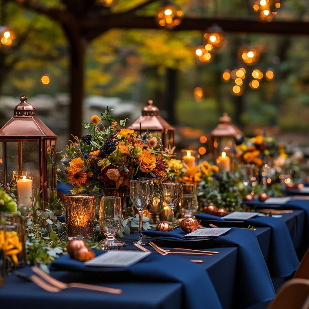
I love unexpected fall combinations, and navy with copper is such a good one. The contrast of cool navy and warm copper feels modern and memorable.
Use copper chargers, navy fabrics, and ivory flowers to keep the look balanced.
Wine Red and Blush Wedding Palette
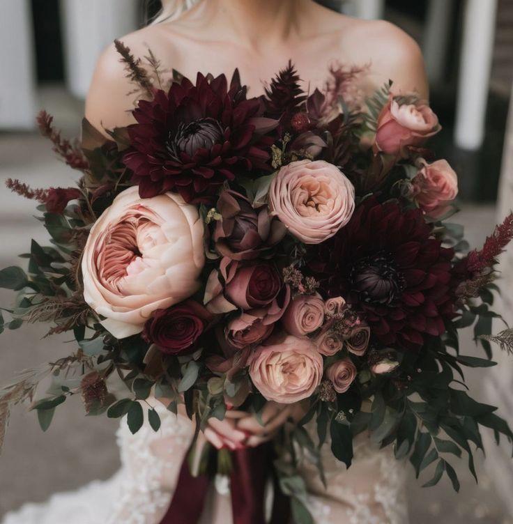
Wine red and blush create a softer version of a moody autumn wedding. The deeper shade adds romantic floral depth while blush keeps everything airy.
I would layer roses, silk ribbons, and warm candlelight for a dreamy effect.
Mocha Brown and Ivory Wedding Palette
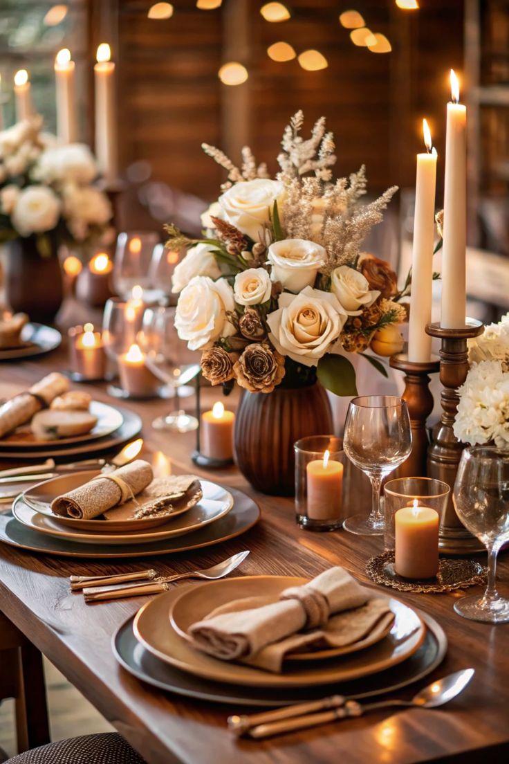
Mocha brown is having a beautiful moment because it feels grounded and timeless. Adding ivory neutral layers keeps the palette elegant instead of overly dark.
This is perfect for wood textures, handmade paper goods, and cozy reception spaces.
Rust and Sage Green Wedding Palette
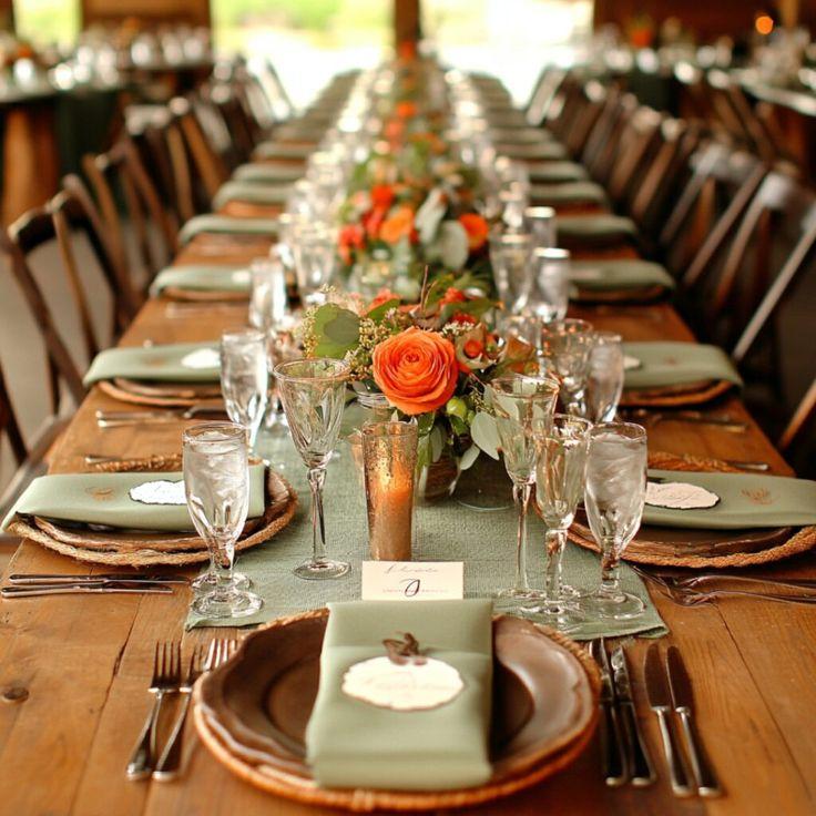
Rust and sage are made for autumn because they combine warmth and softness. I love the way sage balances rust tones with a calm botanical feeling.
Think eucalyptus, clay vessels, and natural fabrics for a beautiful seasonal setup.
Deep Teal and Amber Wedding Palette
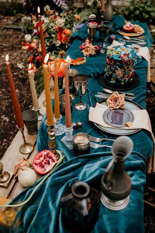
Deep teal with amber feels like a jewel box inspired by autumn evenings. The palette uses rich blue-green and golden warmth for a memorable celebration.
I would add glass candle holders and textured fabrics to make these colors glow.
Plum and Copper Autumn Wedding Palette
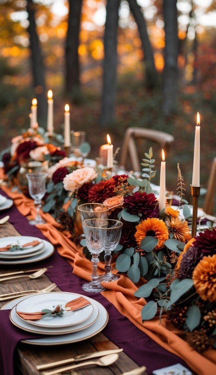
Plum and copper bring together romance and warmth in a very collected way. The jewel-tone plum base looks especially beautiful beside glowing metallic accents.
I would use copper details sparingly so the flowers and fabrics stay the stars.
Midnight Blue and Burgundy Wedding Palette
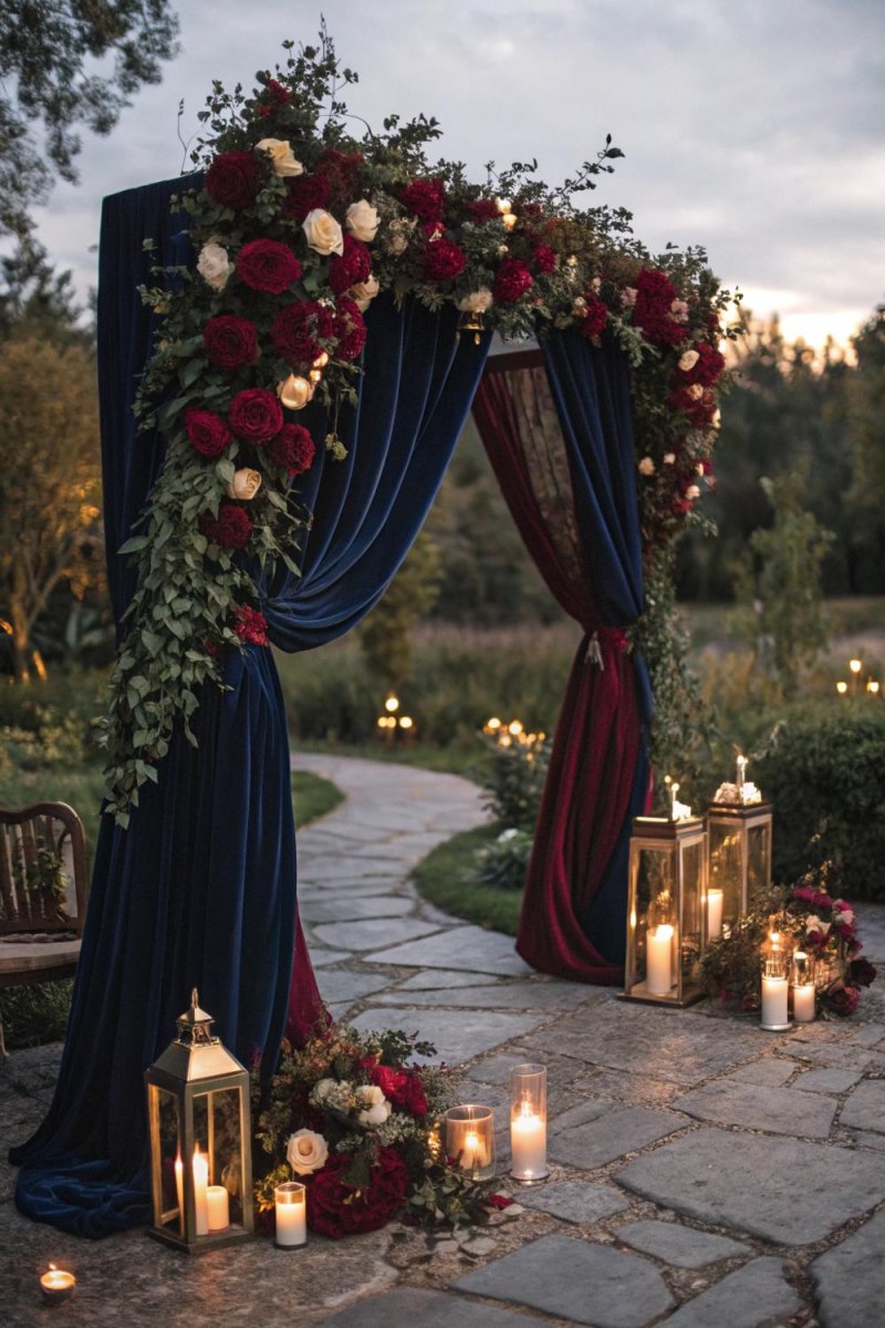
This palette feels perfect for late autumn evenings. Midnight blue and burgundy create deep seasonal contrast while still feeling classic.
Pair dark linens with soft florals and warm lighting to avoid a heavy look.
Black, Ivory, and Gold Wedding Palette
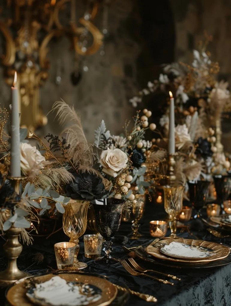
Black, ivory, and gold is a timeless choice when you want drama with elegance. The black and gold combination gives a moody romantic feel that photographs beautifully.
I would soften the contrast with ivory flowers and creamy textures.
Chestnut and Deep Rose Autumn Wedding Palette
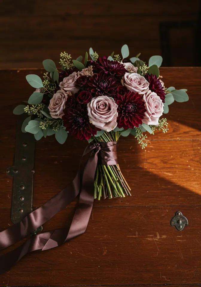
Chestnut and deep rose remind me of autumn leaves, wooden details, and cozy evenings. This palette creates warm romantic layers without feeling predictable.
Use brown accents, rose florals, and tactile fabrics to bring the whole wedding story together.
More Pinterest Visuals